Getting visitors to an online store is only the first step in building an ecommerce business. The much harder question is what happens after those visitors arrive.
A store may receive hundreds of visitors and still generate no sales. When this happens, it is tempting to assume that the website does not look professional enough or that customers simply do not trust the business.
Trust can certainly influence purchasing decisions, but a lack of sales does not always mean that the store has a trust problem.
The real issue may be much earlier in the customer journey. Visitors may not be reaching product pages, the links used in advertisements may be broken, products may be unavailable, the checkout process may be difficult, or the traffic may not be coming from people who actually intend to purchase.
A discussion about building a trustworthy ecommerce page that drives sales demonstrates why store owners should diagnose the complete sales funnel before making assumptions.
The example involves a store that received roughly 400 visits but had not generated purchases. The discussion identified several technical, presentation, and customer-experience issues that could prevent visitors from becoming buyers.
The broader lesson is that trust is not created by one design element. It is created by a combination of functional links, accurate product information, professional presentation, transparency, customer reassurance, and a smooth purchasing journey.
400 Visitors and Zero Purchases: What Does It Mean?
Suppose an ecommerce store receives 400 visitors but no one purchases.
That number alone does not explain what is happening.
There are several possible scenarios.
Perhaps visitors are arriving on the homepage but never viewing products.
Perhaps they are viewing products but not adding anything to the cart.
Perhaps they are adding products but abandoning the checkout.
Perhaps the products they are interested in are unavailable.
Perhaps an advertisement is sending visitors to the wrong page.
Perhaps the visitors are simply not the right audience for the products.
Or there could be a combination of several problems.
Therefore, the first step should be to understand the customer journey.
A simplified ecommerce funnel looks like this:
Visitor → Product View → Add to Cart → Checkout → Purchase
If there are 400 visitors but zero purchases, the important question is:
At which stage are customers leaving?
Without answering that question, redesigning the entire website may not solve the actual problem.
Traffic Quality Matters
One of the most important factors is where visitors are coming from.
Not all website visitors have the same level of buying intent.
Someone searching specifically for a product they want to purchase is very different from someone who clicked a random social media post out of curiosity.
For example, imagine that 400 people visit a store because they saw an entertaining piece of content.
They may be interested in the content but not necessarily interested in purchasing the product.
In that situation, the store could receive significant traffic without generating sales.
This is why store owners should examine traffic sources.
Useful questions include:
- Where are visitors coming from?
- Which campaigns generated the visits?
- Which social platforms sent the traffic?
- What pages are visitors landing on?
- How long do visitors stay?
- Are they viewing products?
- Are they adding items to their cart?
Traffic volume is useful, but traffic relevance is more important.
The Landing Page Is Extremely Important
A visitor’s first page can strongly influence what happens next.
If an advertisement promotes a particular product but sends the visitor to a generic homepage, the customer has to search for the product again.
That extra effort can create unnecessary friction.
A better customer journey is often:
Advertisement → Relevant product or collection → Product information → Purchase
The landing page should match the message that attracted the visitor.
If an advertisement promises a particular product, the customer should be able to find that product immediately after clicking.
This consistency helps reduce confusion.
Broken Links Can Destroy Sales Before Trust Becomes an Issue
One of the most important problems identified in the discussion was a shared collection link that reportedly returned a Page Not Found error.
This is a fundamental ecommerce problem.
Imagine a customer sees an advertisement, becomes interested, clicks the link, and arrives at an error page.
The customer cannot purchase because the buying journey has stopped before it even begins.
This is not primarily a branding problem.
It is a functional problem.
Even the most professional-looking store cannot generate a sale if customers cannot reach the products.
This is why every important customer-facing link should be tested before advertising campaigns are launched.
Store owners should test:
- Homepage links
- Product links
- Collection links
- Social media links
- Advertisement links
- Navigation menus
- Buttons
- Checkout paths
A link that works on one device or browser should also be tested on mobile devices and in a fresh browsing session.
Test the Store Like a Customer
One of the practical recommendations from the discussion is to test the entire customer journey in an incognito or private browsing session, particularly on mobile.
This is valuable because store owners often see their website differently from new visitors.
The owner may already know where products are located.
They may have their account logged in.
They may have previously visited the pages.
A new customer has none of that context.
Testing from the customer’s perspective can reveal problems that are easy to overlook.
For example:
- Open the advertisement or social link.
- Check where it lands.
- Try to find the advertised product.
- Open the product page.
- Review the product information.
- Add the item to the cart.
- Begin checkout.
- Check shipping information.
- Review payment options.
- Complete the purchase journey where appropriate.
If something feels confusing during this process, a new customer may experience the same problem.
A Custom Domain Can Influence Perceived Trust
Another issue highlighted in the discussion was the continued use of a default platform-related domain rather than a custom branded domain.
A store address is one of the first signals customers see.
A custom domain generally gives a business a more established and recognizable identity.
For example, a branded domain communicates that the store is operating under its own identity rather than simply using a temporary setup.
This does not guarantee sales.
A custom domain cannot compensate for poor products, broken links, bad pricing, or weak customer service.
However, when customers are deciding whether to trust an unfamiliar online business, the overall presentation matters.
The domain should therefore be part of a broader trust-building strategy.
Placeholder Content Makes a Store Look Unfinished
Another significant issue identified in the discussion was placeholder theme content such as “Feature 1” and generic default copy.
This may seem like a small design issue, but it can have a major effect on customer perception.
Imagine visiting a store and seeing:
- Generic headings
- Placeholder feature names
- Default descriptions
- Incomplete sections
- Unrelated images
- Empty product categories
The customer may assume that the business is unfinished.
Even if the products are legitimate, an unfinished-looking website can create uncertainty.
Customers may wonder:
- Is this a real business?
- Can I trust this store?
- Will my order arrive?
- Will I receive customer support?
- Is this website still under development?
Replacing placeholder content with clear, product-specific information is therefore an important step.
Product Pages Need to Answer Customer Questions
A product page should not simply display an image and a price.
Customers often need enough information to decide whether the product is right for them.
Depending on the product, useful information may include:
- Product benefits
- Key features
- Size or dimensions
- Materials
- Available variations
- Usage instructions
- Delivery information
- Return information
- Customer reviews
- Frequently asked questions
The goal is to reduce uncertainty.
If customers have unanswered questions, they may leave the page and search elsewhere.
Sold-Out Products Can Create a Dead End
The discussion also identified another potential problem: fallback homepage recommendations reportedly contained products that were sold out.
This creates another form of friction.
Imagine a visitor clicks a product link and discovers that the item is unavailable. The store then recommends another product, but that product is also unavailable.
The customer has nowhere useful to go.
A better ecommerce experience should guide customers toward products that are actually available.
When a product is sold out, the store can provide alternatives, but those alternatives should be relevant and purchasable.
Otherwise, the customer journey ends without an opportunity to convert.
Trust Signals Should Be Added After Functional Problems Are Fixed
Once basic functionality is working correctly, the store can focus more heavily on trust signals.
These may include:
Customer Reviews
Reviews provide evidence that other people have purchased and used the products.
Clear Shipping Information
Customers should know when they can expect their order and whether shipping costs apply.
Transparent Return Policies
A clearly explained return process can reduce purchase anxiety.
Contact Information
Customers should be able to understand how to reach the business if they have questions.
Secure Payment Information
Customers should feel confident that their payment details are handled appropriately.
Consistent Branding
Professional logos, colors, product imagery, typography, and messaging can create a more cohesive identity.
Together, these elements help create a more credible customer experience.
Mobile Experience Is Especially Important
A large percentage of ecommerce browsing happens on mobile devices.
A store can look excellent on a desktop computer while having problems on a phone.
Common mobile issues include:
- Slow loading
- Buttons that are difficult to tap
- Text that is too small
- Images that do not display correctly
- Navigation that is confusing
- Product information appearing too far down the page
- Checkout elements being difficult to use
This is why mobile testing should be part of the store review process.
The customer should be able to move from landing page to product to cart without unnecessary obstacles.
Analyze the Funnel Before Changing Everything
A useful way to diagnose the situation is to divide the customer journey into stages.
Stage 1: Visitors
How many people arrive?
Stage 2: Product Views
How many visitors actually view products?
Stage 3: Add to Cart
How many show enough interest to add something?
Stage 4: Checkout
How many begin the purchasing process?
Stage 5: Purchase
How many complete the transaction?
Suppose the store receives 400 visitors.
If only 10 view products, the problem may be the landing page, navigation, or traffic quality.
If 200 view products but none add to cart, product presentation, pricing, or trust may need attention.
If 50 add to cart but none complete checkout, shipping, payment, or checkout friction could be involved.
This type of analysis is far more useful than simply saying, “My website does not look trustworthy.”
Build Trust Through Consistency
Trust is created when everything on the website supports the same message.
The advertisement should accurately represent the product.
The landing page should contain the promised product.
The product page should provide accurate information.
The price should be clear.
Shipping and return policies should be visible.
The product should actually be available.
The checkout should work.
Contact information should be accessible.
When these elements are consistent, customers have fewer reasons to doubt the business.
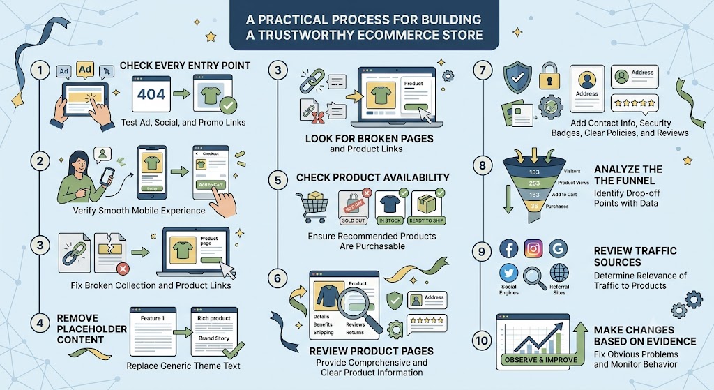
A Practical Store Improvement Process
A store owner facing traffic but no purchases can follow a structured process.
1. Check Every Entry Point
Open every major advertisement, social media, and promotional link.
2. Test on Mobile
Check the complete customer journey using a mobile device.
3. Look for Broken Pages
Make sure product and collection links lead to active pages.
4. Remove Placeholder Content
Replace generic theme text with real product and brand information.
5. Check Product Availability
Make sure promoted products and recommended products are actually available.
6. Review Product Pages
Improve product benefits, images, descriptions, reviews, shipping details, and returns information.
7. Check Trust Signals
Add appropriate contact information, policies, reviews, and consistent branding.
8. Analyze the Funnel
Identify where visitors are leaving.
9. Review Traffic Sources
Determine whether visitors are actually relevant to the products.
10. Make Changes Based on Evidence
Do not redesign everything at once. Fix the most obvious problems and then observe how customer behavior changes.
Conclusion
A store receiving hundreds of visitors without purchases does not automatically mean that the website looks untrustworthy.
The real problem could be traffic quality, broken links, unavailable products, weak product pages, unclear information, poor mobile usability, checkout friction, or missing trust signals.
The discussion provides an important lesson for ecommerce businesses: before trying to increase sales, make sure customers can actually complete the buying journey.
A professional-looking store is valuable, but functionality comes first.
Customers need to reach the correct page. The product needs to be available. The information needs to be clear. The website needs to work properly on mobile. Pricing, shipping, and returns should be easy to understand. Only after these fundamentals are in place does it make sense to focus more heavily on additional trust-building and conversion improvements.
The most useful question is therefore not simply:
“Does my store look trustworthy?”
A better question is:
“Where exactly are customers leaving, and what is preventing them from completing their purchase?”
Once that question is answered using actual funnel data and customer behavior, store improvements become much more focused.
Ecommerce growth is rarely about one magical design change. It comes from removing friction at every stage of the customer journey and giving visitors enough confidence, information, and convenience to make a purchase.
A trustworthy store is ultimately one where the entire experience works together—from the first click to the final purchase.


0 Comments